
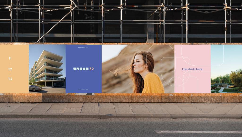


Urban32 is a residential development located in the city of Espinho, which presents itself as “the ideal place for any lifestyle”: close enough to an urban center full of resources, but far enough away from all the unwanted hustle and bustle. The challenge of this project was to create a graphic identity that would reach and attract a younger, urban audience.
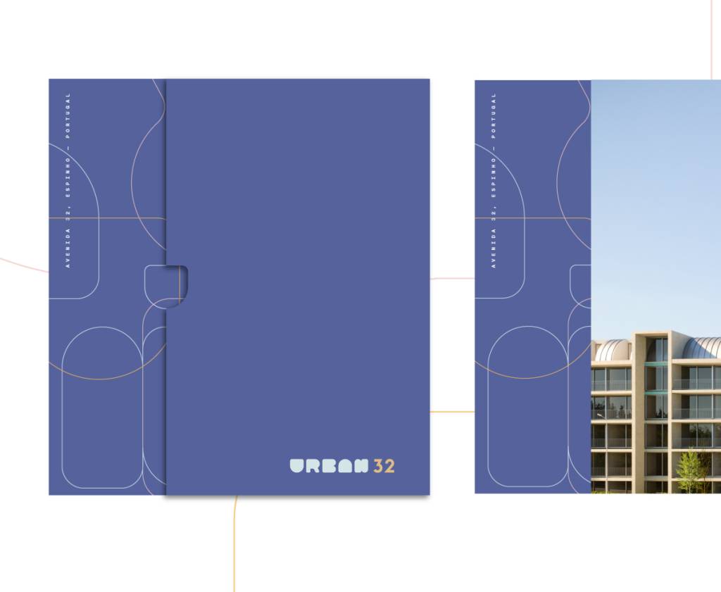
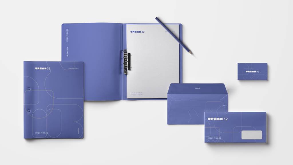
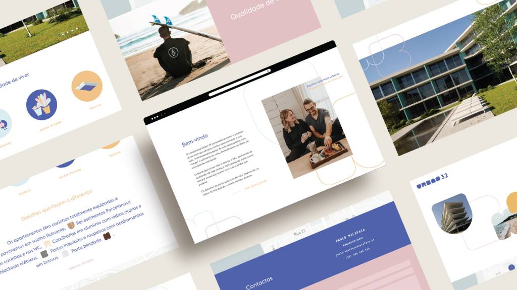
The blossoming of this identity begins with the creation of brand typography, based on rounded shapes and counter-forms, united in a unique, customized logo. With a fresh, young, and minimalist character, it stands for a lifestyle focused on the urban world and the life of a new generation.
From these same shapes and their contours and outlines, patterns and textures are widespread among larger pieces of brand identity. Also, photographs of the space can be added to these graphics, which seem to naturally flow between them. The selected color palette also refers to a youthful universe, through the exploration of very bright pastel shades, symbolic of the very architecture of the building and the mindset it represents.
80% of the apartments sold